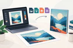
A custom derby cover starts with more than a killer image. Artwork file preparation is what separates a sharp, full-coverage piece that sets your ride off from a muddy print, chopped-off logo, or photo that falls apart the moment it is enlarged. Your bike deserves better than cookie-cutter chrome. If you are putting your own photograph, unit logo, business mark, skull graphic, flag, or original design on a precision-machined part, give that artwork the respect it deserves.
The good news is you do not need to be a graphic designer to send usable art. You just need to understand what makes an image print cleanly on a small, round, high-visibility motorcycle part.
Artwork File Preparation Starts With Image Quality
The biggest mistake riders make is grabbing a small image from social media, a website, or a text message and expecting it to cover a derby cover in razor-sharp detail. Those files may look good on a phone because the screen is small. Once the image is enlarged and hard-coated onto a part, weak resolution shows its teeth.
Start with the largest original file you can find. A photo taken directly from a modern phone at full size is usually far better than a screenshot of that photo. If you had professional photography taken of your bike, family, military service, hunting trip, tattoo art, or company logo, request the original digital file rather than pulling it from Facebook or Instagram.
For logos and clean line art, vector files are king. Formats such as AI, EPS, SVG, and PDF can scale without turning edges fuzzy. A vector logo stays crisp because it is built from mathematical paths, not tiny colored squares. If you only have a JPG or PNG, it can still work, but the original needs enough size and clarity for the part you selected.
Do not artificially enlarge a tiny image and assume the problem is fixed. Increasing the pixel dimensions may make the file larger on paper, but it cannot create detail that was never there. Sometimes an image can be cleaned up or rebuilt, especially a simple logo. Highly detailed photos are different. A low-resolution face, pet, patch, or background will remain low resolution when stretched.
Design for the Shape of the Part
A derby cover is not a flat rectangular poster. It is a round or shaped motorcycle component with bolt holes, edges, curves, and a center area that grabs the eye first. Artwork that looks perfect on a laptop can need a different crop to look right on the bike.
Put the main subject in the center whenever possible. Faces, skulls, eagles, badges, and logos generally hit hardest when their most important detail has room to breathe. Avoid placing critical text, eyes, or fine elements near the outer edge. Depending on the cover style, that area can be affected by the part’s shape, bolt locations, or the natural crop of the design.
This matters even more with words. A long slogan wrapped around a circular cover can become hard to read at a glance. A short statement, name, call sign, club abbreviation, rank, or date usually carries more punch. Think about how your artwork will read from a few feet away in a parking lot, at a stoplight, or lined up with other bikes at a rally.
If your art includes a full motorcycle, a group photo, or a wide landscape, expect a crop decision. You may need to choose whether the cover features the rider, the bike, the flag, the mountains, or the sunset. Trying to cram every inch of a busy photo into a small round canvas usually creates a design with no clear focal point.
Keep the Important Stuff Away From the Edge
Give your image a safe zone. That means leaving a little breathing room between the important artwork and the outer boundary of the part. A border, smoke effect, flames, dark texture, flag field, or background color can make this easy while giving the design a finished look.
A logo that sits dead center with a strong background is often more aggressive and more readable than a complicated design forced to the rim. Simple is not generic when it is yours.
Use Color That Hits on Metal
A hard-coated custom cover can carry serious color, but artwork still needs contrast. Black artwork on a dark background may look mean on a monitor and disappear when viewed outdoors. Fine gray details can get lost. White lettering over a bright sky can vanish from a few steps away.
Build contrast around the main subject. Light lettering needs a darker field behind it. Dark logos need a lighter or more colorful backdrop. Red, orange, and yellow bring heat, while blue and black can create a colder, stealthier look. Patriotic graphics work best when the flag, eagle, stars, and text do not fight each other for attention.
Be careful with screenshots and images saved from the internet. Their colors can be compressed, over-sharpened, or distorted by filters. A properly prepared original file gives the final piece a better shot at showing the deep blacks, clean whites, and hard color transitions that make custom motorcycle art take your breath away.
If your design uses neon colors, metallic effects, glitter, or ultra-subtle gradients, remember that screen effects do not always behave exactly the same on a physical finished part. The goal is not to make a computer mockup look flashy. The goal is to make your cover look bad-ass in real light, on a real ride.
Choose the Right File Type Before You Send It
For photographs and detailed full-color artwork, JPG, PNG, TIFF, and high-quality PDF files are common choices. Send the original whenever you can. Avoid repeatedly saving and re-saving a JPG, because each round of compression can throw away detail.
For logos, decals, lettering, and artwork with clean outlines, a vector file is the strongest option. If a designer made your business logo or club mark, ask them for the vector version. It is often sitting in their project folder waiting to be used.
When naming your file, make it easy to identify. Something like Smith-Sportster-Eagle-Logo.png is better than IMG_4837_final_final2.jpg. If you are sending multiple images, label the preferred one clearly. That prevents confusion when there are three versions of the same graphic with slightly different colors or wording.
Do not bury your design inside a Word document, PowerPoint slide, collage app, or email signature if you can avoid it. Those programs often shrink images automatically. Attach the original file directly.
Make Text, Logos, and Photos Work Together
The hardest custom artwork is usually not a single photo or a single logo. It is the design that combines both. Maybe you want your road name over a family photo, a military emblem behind an American flag, or your shop logo paired with a pinup, reaper, or engine graphic.
That can look incredible, but only if there is a hierarchy. Decide what needs to be noticed first. The photo might be the hero, while the text supports it. Or the logo may be the point, with texture and imagery building the attitude around it. If everything is large, bright, and covered in detail, nothing wins.
Use fewer fonts, not more. One strong typeface for a name and one supporting style for smaller text is usually enough. Thin script fonts and extremely narrow lettering can be tough to read on a compact cover. Thick, high-contrast text tends to survive the ride better visually.
Respect Copyright and Ownership
Send artwork you own, created yourself, licensed for your use, or used with permission. Personal photos, original art, your business logo, and designs you commissioned are solid starting points. Pulling a random artist’s work from the web may create problems, even if it would look killer on a timing cover.
If a tattoo artist, graphic artist, photographer, club, or brand created the image, get their okay before turning it into a permanent part of your machine. That is respect for the craft - the same respect you expect for your bike.
Confirm Fitment Before You Commit
The cleanest artwork in the world will not help if the cover does not fit your engine platform. Harley-Davidson Big Twin, Twin Cam, Milwaukee-Eight, and Sportster applications can use different cover shapes and bolt patterns. Indian, Victory, and Suzuki riders also need vehicle-specific fitment rather than a guess based on appearance.
Know your motorcycle’s year, model, engine, and the exact part you are replacing. Are you ordering a derby cover, timing cover, inspection cover, horn cover, fuel door, or console cover? Those details affect both the physical fit and the way your chosen artwork should be cropped.
At Custom Derby Cover, every piece is made to order, so take a minute to verify the selection before submitting your art. Custom production is what makes a one-off cover possible. It also means a last-second change is not as simple as grabbing a different part off a dealership shelf.
Give Your Design One Last Real-World Check
Before you send the file, look at it without zooming in. Can you immediately tell what it is? Can you read the name, date, or statement? Is the key photo centered? Does the design still look tough without relying on tiny hidden details?
Then check the practical stuff. Confirm spelling, punctuation, dates, rank, unit numbers, phone numbers, and website text if any appears in the art. A typo on a temporary graphic is annoying. A typo on a hard-coated custom cover is a different kind of pain.
Your motorcycle is already personal. The miles, the scars, the upgrades, and the stories make sure of that. Bring the same intent to your artwork, send the best original file you have, and let the finished cover say exactly what you came to say.